Wednesday, 17 August 2011

Final Project- Laser cut: From procedures to presentation

Finding a fluid form for my stall was important - i wanted those who walked inside to be engulfed and surrounded by an array of aromas and sights, and to visually capture how these scents rotate and move around and across the space. I used a small model at first to explore shape, in which I cut the previous model into strips and arranged them in different sized circles, slightly overlapping one another. i joined them together to create a very circular shape (retained from the first form) and from here eventually decided on a similar form to that of my final design,  shown below.

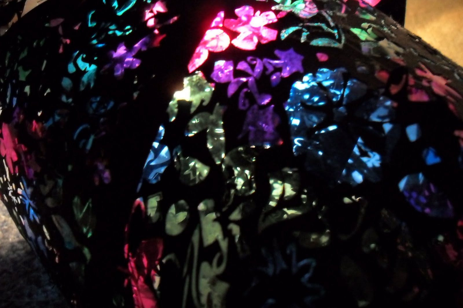
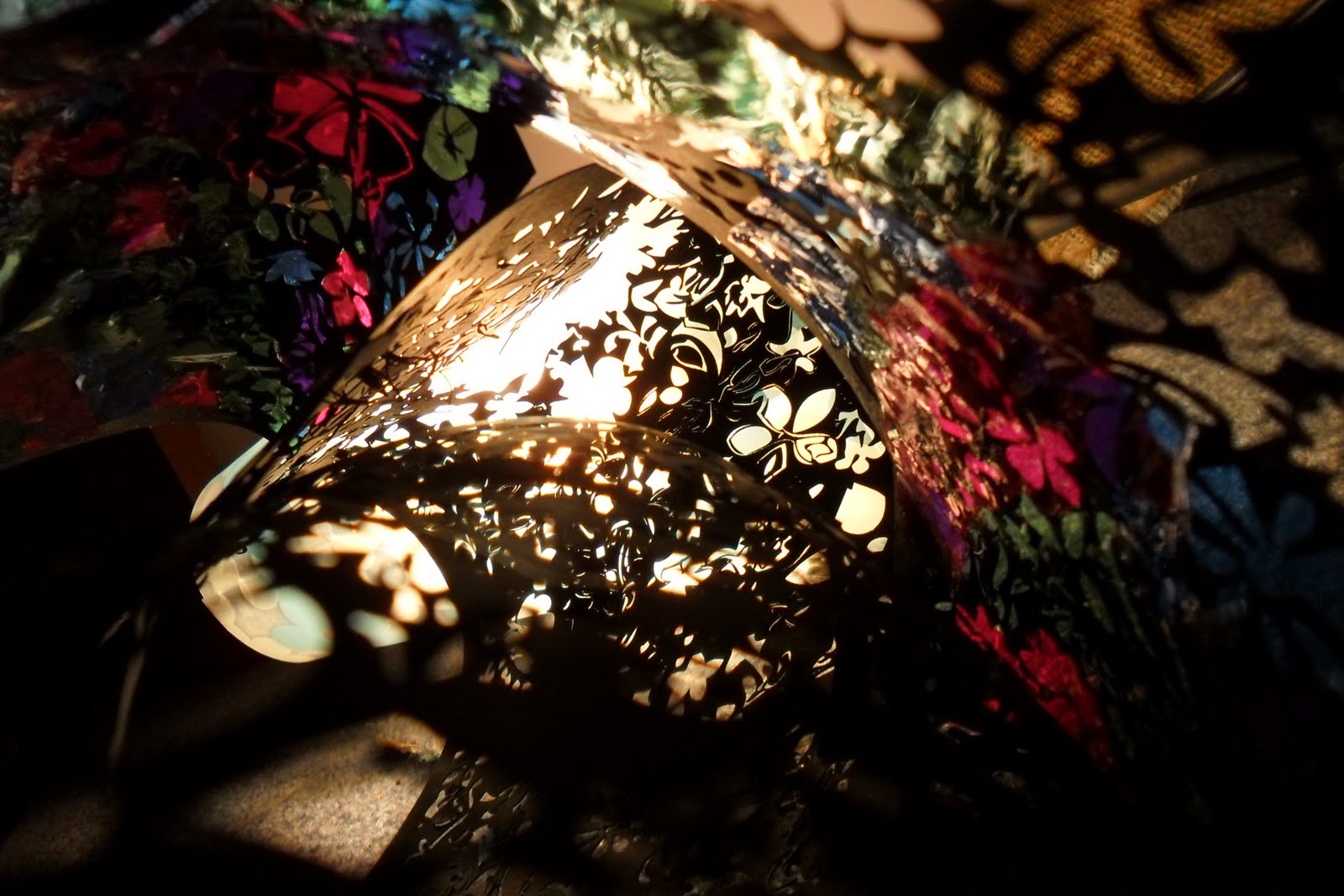
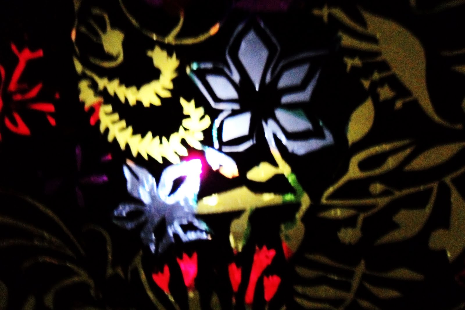
Here are the end results, after using illustrator to generate the pattern, the laser cut, and the addition of cellophane.

What it might look like to step into the stall...


The exit/ entry ... though preferrably the exit, because it offers the open side to attract customers, while thos who have travelled down the path can leave in a much less hectic atmosphere.


 The Outer skin layer
 Light effects as the light catches all of the layers
Sense of mixture and unpredictability - two key qualities in my initial design.


I felt like the model and photos generally achieved what i wanted in terms of ideas and visualisation.

Saturday, 13 August 2011

Lasercutting Research

Just some images i've come across recently that had a lot of potential in terms of ideas I might use. They are much more practical than the images a had before, and a lot of them have actually been laser cut. The forms are useful as well.
 This intricate detail is something I'm really interested in capturing in my own final design.
Nice use of Layering in this image. I started thinking about having light feed into one another, so perhaps the solution to the layering effect i want might come from putting layers within other layers, and seeing the effect this creates.


Layering use - definately what I'm going for, and has this detail i really like as well.

Antony suggested hanging  features... perhaps something of this nature will give me some ideas.

Lovely form, and also playing with light.
                                                                                      

This shape had a very earthy feel to it, almost like the stems of plants intwining....

Adored this.

Friday, 12 August 2011

Week 4 - Lasercutting

This projects theme is 'sustainance'. As a group, we've been given the task of coming up with a market stall in relation to this idea. Some ideas that came from the group were market stalls selling musical instruments, clocks, second hand books, clothing.... amongst many others. My idea was plants, because i figured, what could be more sustainable than plants? At first i wasn't sure what i would specifically sell in my stall .... would i deal in seeds, ornamental plants, culinary plants, crops.etc....
But, after a little bit of thought about what might offer the best ideas in terms of architecture, i decided upon the culinary and ornamental side of things. This might include essential oils, spices, herbal remedies, pressed flowers and pot pourri, among other things. It conjured up images of coloured bottles and stained glass, and hidden treasures... the flower element brought a diverse set of ideas as well, such as transluscency, fragility and layering. Playing with light became a huge part of my focus as a result, and it will be interesting to see where this takes me.
Below are some google images that i found very dynamic, and there are certain features of them that i found very inspiring and that i think will help my progress along.


Bottles and Stained Glass - beautiful materials and also create this lighting effect I'm interested in. The filtering of colours, and how they mix and blend together, in the same way oils and fragrances might.

 I loved this image, and it really seemed to capture the effect I am looking for. This idea of mixing colours, and layering that I have been searching for is best explained, at least at the moment, by this image.

Note the transluscent flower petals, and the gentle overlapping at the centre of the flower. At the points of overlap, the colour appears stronger and more vivid. This is an idea i would like to work with.


I found this form very interesting, and i liked how they had used the material itself to create this shape. I felt as though the last three images really captured how one material (in this case flowers and other plant matter) could be used to create a whole new image, beyond the typical idea of the form of a plant or flower.

Wednesday, 10 August 2011

Peer Reviews, Week 4

So this week we did peer reviews, which is basically when you do a semi-crit of other students. Even though it was confusing at times, I decided it was definately beneficial. Not only did it mean getting to know other students, it also meant getting a more diverse view of what other students had been doing - both in terms of inspiration and experience (for example, Vas shared some details about using illustrator for laser cutting which should be really useful).

SAM'S CRIT
The first crit I did was of Sam Wong. Sam had some really nice work with him! He drawn inspiration from the windows of the buildings around the site, thinking of them as portals, in a way, to another place. His model reflected this well, I thought, because his arrangement was four different boxes (no top or bottom though, just four sides) into which were cut different sets of windows. He mentioned that these were actual windows he had seen around the site and documented, then arranged with the many other sets. He was going for a lighting effect, and i really admired the way he had combined photography and lighting to create this space which altered negetive with positive, then captured in photo. Unfortunately, i didn't have my camera with me that day, but I was impressed! He had a wonderful photo with him, which would've been nice to have a copy of... His idea was really unique and i thought he did a great job!

VAS' CRIT


I then critted Vas Rakovic, whose model immediately impressed me. His model was beautifully presented - I really felt that how he had presented it gave it a real presence. He had taken many inspirations, but drew a lot of ideas from the old train station on site. He described observing the building and how, even though it appears majestic from the front, it isn't really maintained, and as you move around it, the walls become derelict with a sense of abandonment. The patterns were inspired by patterning he had seen on the building, with the pipe a throw back to the more sinister side of the station. The pipe could also be used as a meatphorical link between each pattern, as if breaking them down into different periods of time. I viewed it as a representation of bygone times, running through to the present. The scorched wood gave it an authentic appearance which added to this.


This is just a picture i grabbed off of Vas' blog, because it captured that forgotten, derelict vibe i got from his work. This is part of the site he took his inspiration from, and he wrote about how unpleasant it must be for people to wake up to this view. He hoped to create a place of waking up that had the lovely Beaux Art style, without the negative elements, such as this, that he'd experienced during his exploration.


TESSA'S CRIT
Later, i critted Tessa  Forde, who had created this interesting piece that played with light, and created a pattern when the sun passed through. For the best effect, she directed me to her blog, where i found some images she had taken that captured perfectly what she had described.
 
The first picture is how I viewed Tessa's project, which i still thought looked really effective and still portrayed her idea about the light passing through the leaves of the trees and creating the pitch-patched effect on the ground below. But her blog pictures definately showed her idea in a new, impressive light - and were more effective when used with the correct lighting (she couldn't have got the effect in the studio).
Here are a few more where she'd used different coloured lights to give a different perspective and emotion to her piece.
 
I thought the photos were pretty amazing, and added a new feel to what was already a nice idea!