April's Archi Blog :D
Wednesday, 28 September 2011
Basic Form
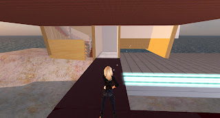
Here's the very basic form of my building. It's still in need of some tweaking, especially with textures, but we'll get there. The second photo is just showing how i used the context with my building. The bridge of a previous building forms what is now a walkway to my Architectural firm - pretty convenient placement, I say!
The Cental Elevator
The elevator plays quite a crucial role in my building. It forms the centre piece of the firm, which is probably suited considering the feeling of movement in Chirag's piece, and in the twisted additions. This central piece flows between floors 2, 3 and 4. These pictures were raken before my alterations to the building, but in a later post it should be more obvious what this area really looks like.
The top of my building was renovated to be circular, much like, again, this rotating prim. Then very top has a dome. I liked this idea of having this light filter down right through the centre of the building from the top floor. In fact, I liked the idea of being able to see down into areas below (or above) from other floors. I felt it meant people could maintain some kind of human connection, whilst still feeling as though they had their own privacy, security and seperation. This was a part of my idea that spiralled off from my 'smile' idea last week. When someone smiles at you, it creates this sense of belonging and worth in the reciever, and they probably feel inclined to smile back. A sense of belonging, and of being a part of something, is in some ways just the basic instinct for security. In saying this, I wanted to keep this sense of belonging amd security while still trying to maintain that division and privacy the firm needs.
Additionally, the internal, centred elevator forms a centrepiece, or common point, between all the floors, hopefully creating more of a sense connection between each floor and the inhabitants.
Shapes and Forms
My building has a lot of curves and twists, and there is in fact a reason for this. this was an idea inspired by Chirag's sculpti, which consists of 2 different spherical-like prims that rotate in the opposite direction around a circle of light. Using this idea, i decided to see what would happen if i twisted a prim in 2 opposite directions. Long behold, this shape was created that i quite fancied. With this in mind, i used it to decorate my building. The edges of the stairs, and the structures on the elevator all carry with them a slight to extensive twist.
Friday Night: The Beginnings of my design
I started putting my design up on Friday night - figured i better try and get a head start on things. I found this little block of land right on the boundary of Kaiako, which, although sounds like a peculiar choice of setting, fitted nicely, since in the actual setting the site is pinned between 2 buildings, and exposed to the same two sides.
You'll notice i'm putting in a whole lot of stairs all over the place... probably isn't helping the prim shortage, and it took me a while to me them all. But the purpose, and i suppose main reason for the high number of stairs is verticality. In a restricted area, i wanted to create a large space (get more for my money basically) and build up. Not only will this seperate me from the surroundings of the more urban landscape at higher levels... it will also enable me to enhance the views, and seperate work areas via height to a platform seperate from most other buildings (exceptions would be vector arena and to a degree, the train station).
The walls work with this idea of keeping things vertical and elongated. This was part of my initial design, but i enhanced it further using inspiration drawn from Amrita's sculpti I obtained. It was very vertical, and pointed (i'll flick a picture up sometime soon) and was almost like an inverted wall of my building.
As explained, 'building up' was something I felt quite strongly about, and with Amrita's sculpti, helped informed the shape.
Sunday, 25 September 2011
Beginnings of my Building
Ok so a few days ago, I began the construction of my architectural office. It was quite an experience putting it in second-life, 3-D format. In fact, i hadn't quite realized how big it would look amongst the smaller scale projects of other groups. Nevertheless, it has begun, with a few minor additions to the mix, such as the more open, circular style roof. I must say, this is not any where near complete, but just got the memo that once again Kaiako was full! GAH! But luckily i've got the very main parts of my structure in, so I haven't gone into mad panic. Here are just a few pictures of myself building the Architectural Firm I designed for the 'Gathering' project previously:
As far as renovations go, I'm trying to think about this idea of creating happiness, and that inital response to simply smile when entering the architecture.... How I'll achieve this, I'm not yet sure. What I can mention is why i decided to alter the roof to this new, 'open to the sky' structure (bearing in mind it isn't finished and will be a lot less 'open to the sky' than it currently is :) It's a well known fact that natural light enahnces the mood of a building's inhabitants. Considering this, it makes it a feature that I couldn't look past in the design. I was inspired by the object I obtained from Chirag, in which he dealt with this idea of 'giving light'. So there is a connection to this, as well.
Subscribe to:
Comments (Atom)


